Technology
SPSS LESSON: CREATING CHARTS TO INTERPRET DATA
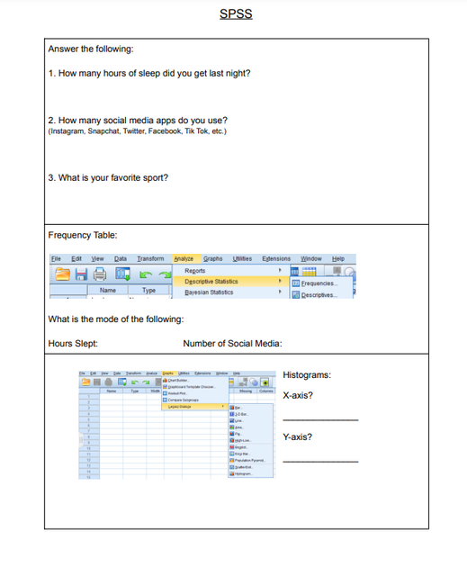
SPSS is a software that allows closer analysis on statistical practices, as well as other mathematical platforms. It is an excellent source of technology to analyze and interpret data. In this lesson, we discovered how to create frequency tables, histograms, pie charts, scatterplots, and correlation. Each topic is beneficial to learning, but can also be a great teaching tool to analyze student progress. Record keeping is critical in teaching, and SPSS provides variety in data collection, and methods for interpretation. Technology is not only beneficial for differentiated instruction in students who succeed with it as a resource, but to also support teacher productivity.
Click on the worksheet image to see the full worksheet.
Click on the worksheet image to see the full worksheet.
